Fitness Brand Symbol & Visual Identity Design
Branding
2023. 12. 20.
This project establishes a clear visual framework for a fitness brand by distilling its philosophy and growth vision into a single symbolic system—one that operates consistently across space, advertising, and all forms of brand communication.

When Growth Needs a Center
As a brand begins to enter a phase of growth, the first thing it needs—design-wise—is a clear visual center.
This fitness brand already had a strong philosophy and well-defined programs, but it lacked a visual system that made those values immediately legible. What was missing was a symbol that could express where the brand stands now, and where it is headed.
Designing Without an In-House Team
With no internal design team in place, the challenge was to establish a coherent design standard and visual language that could run through the entire brand.
This was not about creating a single logo—it was about designing a reference point that would continue to function across future spaces, advertising, and content.
A Metaphor That Carries the Brand
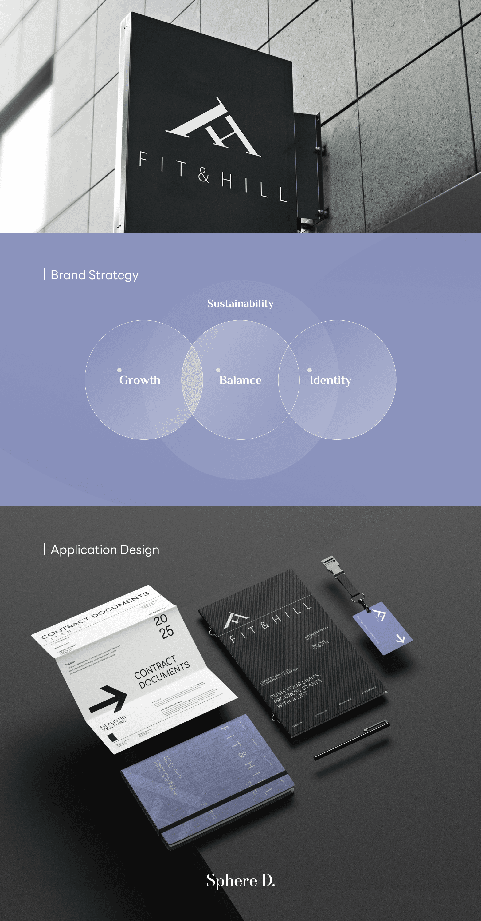
Sphere D distilled the brand’s core values into three keywords: Growth · Balance · Identity, and unified them into a single structural concept.
The metaphor “Gym on the Hill” represents more than a place to work out—it symbolizes the process of discipline, effort, and steady ascent.
The logo symbol is built around the brand initials F and H.
Angled lines and supporting forms visually reference the slope of a hill and the idea of balance. Restrained geometry, generous negative space, and a calm blue palette convey the energy of fitness without exaggeration, creating an image that feels grounded and sustainable.
A Visual Language That Scales
The symbol quickly evolved beyond a logo into a visual standard for the brand.
Members began to experience a consistent impression across space and content, and the brand’s identity as a fitness brand became clearer and more recognizable.
From advertising assets to interior graphics and spatial design, everything was unified under a single visual language—bringing the brand closer to a state where it could be understood instantly, without explanation.
A Quiet Structure That Shows Direction
A strong logo is not a device to attract attention, but a structure that quietly reveals where a brand is headed.
The symbol of FIT & HILL anchors that direction—visually defining the brand’s point of departure.


Sphere D.
Contact.
contact@sphered.kr
+82 70-8098-0775
Location.
Seoul, Korea
Toronto, Canada
Services.
Works.
Copyright © 2025 Sphere D. All rights reserved.
Sphere D | CEO: Hyunyoung Kim | Business Registration No.: 330-33-01418
E-commerce Registration No.: 2025-Seoul Seocho-0075
Address: 11F, 17, Seocho-daero 77-gil, Seocho-gu, Seoul, Republic of Korea