Website Font Pairing: A Guide to Successful Design
2025. 6. 17.
Homepage

Hyunyoung Kim
Founder of Sphere D, a design and strategy studio analyzing global tech trends and product positioning.
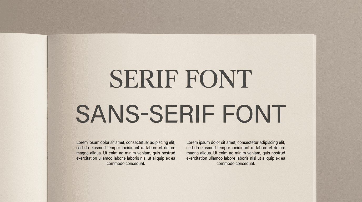
In website design, font selection goes beyond visual preference—it is a strategic decision that shapes brand credibility and message clarity. Pairing overly similar serif or sans-serif typefaces, or combining fonts with conflicting tones and weights, reduces contrast and readability, resulting in designs that feel either monotonous or visually chaotic.
At Sphere D., we recommend clearly distinguishing headings and body text through purposeful contrast, readability-first composition, and type choices aligned with the brand’s tone. Thoughtful font pairing elevates the overall quality of a website and becomes the foundation for delivering a consistent, confident brand experience.

When building a website, font selection is often overlooked—but it is a critical factor in shaping a brand’s first impression. Poor font pairings can confuse visitors or make content difficult to read. In contrast, the right typographic choices clarify brand messaging and elevate a website’s sense of professionalism.
Here, Sphere D. designers share common font combinations to avoid—and the smarter alternatives that create clarity, balance, and a stronger brand presence.
1. Avoid Pairing Similar Serif Fonts
Problematic Pair: Playfair Display + Libre Baskerville
Both are elegant, classic serif fonts. Using them together can reduce visual contrast, making the design appear monotonous.
Alternative: Use Playfair Display for headings and a sans-serif like Source Sans Pro or Open Sans for body text. This creates readability and a refined layout.
2. Similar Sans-Serif Fonts Can Cause Confusion
Problematic Pair: Raleway + Montserrat
Both are geometric sans-serifs with similar shapes and weights. When used together, the lack of contrast can flatten the design.
Alternative: Use Montserrat for headings and a serif like Merriweather or Lora for body text to establish visual rhythm.
3. Mismatched Modern Font Styles
Problematic Pair: Exo + Rajdhani
Both are modern sans-serifs, but Exo is wide and angular while Rajdhani feels narrow and technical. Together, they may create visual tension rather than harmony.
Alternative: Use one unique-style font for headings and pair it with a neutral sans-serif like Open Sans for body text to maintain balance.
4. Weight and Tone Imbalance
Problematic Pair: Merriweather Bold + Quicksand
Merriweather Bold is heavy and strong, while Quicksand is light and soft. Extreme weight differences can feel visually unstable.
Alternative: Keep Merriweather Bold for headings and pair it with a readable sans-serif like Lato or Open Sans for body text, creating natural weight contrast.
5. Conflicting Font Personalities
Problematic Pair: Roboto + Playball
Roboto is clean and practical, while Playball is a romantic script. Together, the conflicting tones reduce cohesion.
Alternative: Use Roboto as the main font and reserve Playball for buttons, highlights, or limited areas for emphasis.
6. Minimal Modern Sans-Serif Balance
Problematic Pair: Manrope + DM Sans
Both are minimal, modern sans-serifs with similar proportions, which can dilute each font’s impact.
Alternative: Choose one sans-serif as the main font, and introduce a serif or display font for headings or emphasis to create contrast.
7. Avoid Overly Dramatic Contrast
Problematic Pair: Alfa Slab One + Lato
A bold display font paired with a soft sans-serif can create strong contrast, but excessive difference may feel unbalanced.
Alternative: Use Alfa Slab One for headings and a stable sans-serif like Open Sans for body text to guide the reader’s eye naturally.
If you want, I can also create a visual cheat sheet of these font pairs so you can see the dos and don’ts at a glance—perfect for web design reference. Do you want me to do that?
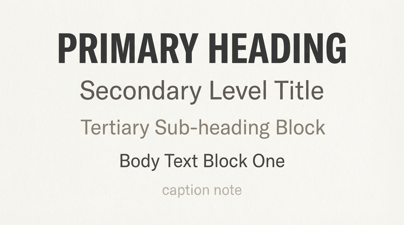
Core Principles for Successful Font Pairing
1. Limit to 2–3 Fonts
Using too many fonts creates visual chaos. Stick to one font for headings and another for body text, or use variations within a single font family.
2. Ensure Clear Contrast
Create differentiation in style, weight, and proportion to maintain readability and visual rhythm.
3. Prioritize Legibility
Reserve decorative or elaborate fonts for headings or highlight areas, and choose clean, easy-to-read fonts for body text.
4. Align with Brand Tone
Select fonts that reflect your brand’s personality. For example:
Professional and classic → Serif fonts
Friendly and approachable → Rounded sans-serifs
Font selection on a website goes beyond aesthetics—it shapes both your brand message and user experience. By following Sphere D.’s guidelines, you can create harmonious, sophisticated font pairings that enhance the overall quality and impact of your website.


Sphere D.
Contact.
contact@sphered.kr
+82 70-8098-0775
Location.
Seoul, Korea
Toronto, Canada
Services.
Works.
Copyright © 2025 Sphere D. All rights reserved.
Sphere D | CEO: Hyunyoung Kim | Business Registration No.: 330-33-01418
E-commerce Registration No.: 2025-Seoul Seocho-0075
Address: 11F, 17, Seocho-daero 77-gil, Seocho-gu, Seoul, Republic of Korea