Purple Website Design That Stands Out Online: 9 Inspiring Brand Examples
2025. 6. 15.
Homepage

Hyunyoung Kim
Founder of Sphere D, a design and strategy studio analyzing global tech trends and product positioning.
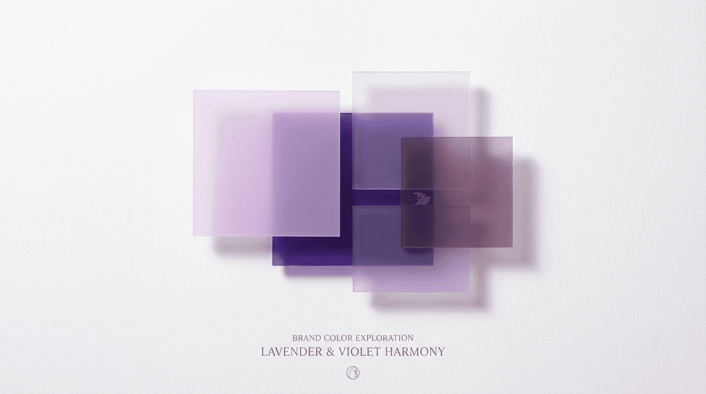
Purple is a strategic color that can convey sophistication, creativity, and professionalism at the same time. When tone, contrast, layout, and typography are carefully balanced, purple moves beyond pure aesthetics and becomes a powerful expression of a brand’s voice.
At Sphere D., purple is never used for show. Instead, it is applied with restraint—aligned to each brand’s character and purpose—to create digital experiences that feel intentional, refined, and memorable.

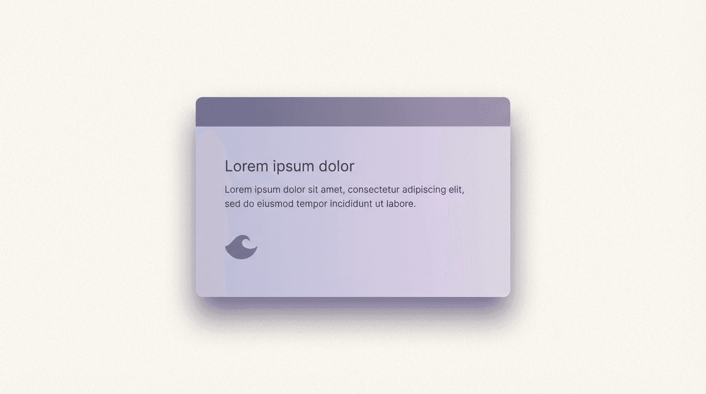
Purple leaves a powerful impression in digital spaces. Deep royal purple communicates luxury and refinement, lavender tones convey calm and emotional warmth, and violet expresses creativity and a sense of mystery. When applied strategically—aligned with a brand’s identity and goals—purple can create digital experiences that stay with users long after they leave the site.
At Sphere D., color is treated as more than decoration. In the process of expanding design into a brand’s voice, we carefully evaluate the meaning and visual impact of color—using it as a deliberate tool to shape perception and memory.
The Brand Experience Shaped by Purple
Purple communicates creativity, luxury, and professionalism all at once. Because color has an immediate impact on user emotion and brand perception, combining the right tone, contrast, layout, and typography can significantly amplify a brand’s message. Across industries such as wellness, fashion, arts, and startups, purple is frequently used as a key visual element to elevate brand value.
At Sphere D., purple is not used for emphasis alone. It is applied with restraint and intention—aligned with brand character and purpose—to create memorable digital experiences.
9 Purple Website Examples Curated by Sphere D.
1. Waggish Writer — Creativity with Warmth
Soft, playful purple tones create a friendly yet creative atmosphere. The color is used consistently across the logo, background, and accents, balancing cheerful visuals with professional typography.
2. The SPAcialist — Luxury Meets Calm
Deep, refined purple conveys both elegance and relaxation. The color choice reflects the spa and wellness identity, guiding users smoothly through imagery, buttons, and layout.
3. Studio Bagaz — Creative Storytelling
Vivid yet gentle purple tones express artistic sensibility and sophistication. Brand messaging and imagery are unified through purple, ensuring strong visual coherence.
4. Copper & Brass — Elegant Stationery Brand
A refined palette combining purple with pink and orange creates a premium feel. Calls to action—such as newsletters and promotions—are subtly highlighted to encourage engagement.
5. Toni Bonini — Energetic Creative Portfolio
Bright colors paired with purple deliver a modern, energetic tone. A grid-based layout improves navigation while reinforcing a contemporary visual identity.
6. DJV Events — Dynamic Event Branding
Bold purple tones evoke excitement and energy. Consistent use across the site establishes a strong and recognizable visual identity.
7. Women Techmakers Belfast — Professional & Inclusive
Deep indigo purple combined with light green accents balances professionalism with approachability. Clear event information and resources encourage active participation.
8. Jed Donahue Editorial — Clean Yet Creative
Subtle purple tones maintain a professional impression while preserving creativity. Portfolios, testimonials, and client logos reinforce trust and expertise.
9. AIAASC — Authority in Education
Purple-blue tones communicate credibility and professionalism. Partnerships, certifications, and news updates are presented clearly to strengthen institutional trust.
Purple, when used thoughtfully, becomes more than a visual choice—it becomes a brand language. Through tone, structure, and restraint, these examples show how purple can shape perception and leave a lasting impression online.
Practical Tips for Building a Purple Website
To use purple effectively as part of a brand experience, the first step is to clearly define the tone and color combinations. At Sphere D., we begin by selecting a purple tone that aligns with the brand’s identity, then integrate it with layout, typography, and imagery to deliver a consistent and intuitive experience for visitors.
Start by choosing a template or structural framework to establish hierarchy. Next, define a cohesive color palette and apply purple strategically across content and visual elements so everything feels balanced rather than overpowering. Finally, complete the experience with mobile responsiveness and SEO optimization, ensuring the purple website not only looks distinctive but also performs effectively.
When used with intention, purple visually amplifies a brand’s voice and leaves a lasting impression. By combining design execution with branding strategy, Sphere D. helps users intuitively understand a brand the moment they land on the website.


Sphere D.
Contact.
contact@sphered.kr
+82 70-8098-0775
Location.
Seoul, Korea
Toronto, Canada
Services.
Works.
Copyright © 2025 Sphere D. All rights reserved.
Sphere D | CEO: Hyunyoung Kim | Business Registration No.: 330-33-01418
E-commerce Registration No.: 2025-Seoul Seocho-0075
Address: 11F, 17, Seocho-daero 77-gil, Seocho-gu, Seoul, Republic of Korea