A Logo Font Defines a Brand’s First Impression
2025. 2. 18.
Homepage

Hyunyoung Kim
Founder of Sphere D, a design and strategy studio analyzing global tech trends and product positioning.
Sphere D. defines a logo font not as a purely aesthetic choice, but as the starting point of brand strategy.
Typography is a visual language that communicates a brand’s character, credibility, and emotional tone at first glance, and it must be designed with readability, scalability across digital environments, and long-term usability in mind.
Well-constructed logo typography expresses a brand’s attitude without explanation and becomes a foundational element that shapes a consistent brand experience.
A Stylish Logo Typography Strategy Guide by Sphere D.
A brand logo is more than a visual element—it is the first signal of a brand’s attitude and direction. At the very first point of contact, the logo’s form and typography intuitively communicate who the brand is: its personality, its credibility, and the sensibility it stands for.
In recent brand design trends, the focus has shifted away from decorative excess toward structurally refined, text-driven logos. At the core of this shift lies a critical decision: the choice of logo typography.
Sphere D. designs branding systems that are strategically grounded and seamlessly connected—from web design to content experience. In this guide, we explore why typography plays a pivotal role in logo design, and how the right selection criteria can bring a brand’s value into sharp focus.
Why Logo Typography Sits at the Core of Brand Strategy
Logo typography is not a matter of personal taste.
Even with the same name, the impression a brand delivers can change entirely depending on the typeface chosen.
Serif typefaces convey trust, professionalism, and a sense of heritage.
Sans-serif typefaces shape a refined modernity and a clear, confident image.
Script and display typefaces more boldly express a brand’s emotion and individuality.
In this way, typography becomes a visual language—one that interprets and articulates a brand’s tone and manner.
At Sphere D., logo design begins with a clear definition of brand character, industry context, and target audience. From there, we establish a typography direction that aligns strategy with expression.
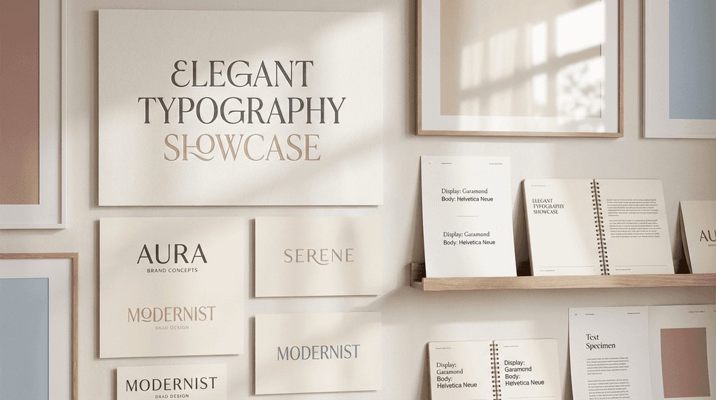
Common Logo Typeface Categories & Strategic Use
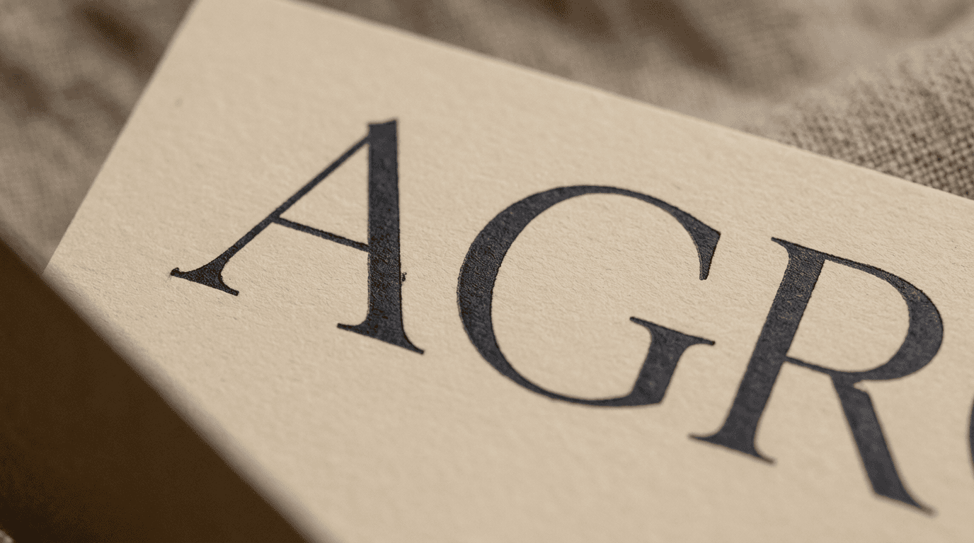
Serif Typefaces: Building Depth and Trust
Frequently used across finance, lifestyle, and premium brands. While rooted in tradition, contemporary display serifs are increasingly adopted in logo design, offering a modern reinterpretation of classic credibility.
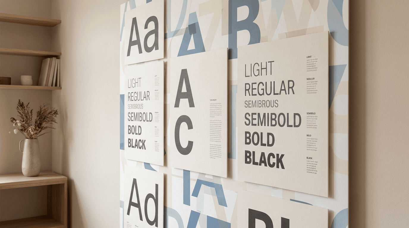
Sans-Serif Typefaces: The Foundation of Modern Brands
A reliable choice across tech, fashion, and creative industries. With excellent legibility and scalability, sans-serif fonts maintain a consistent brand presence across web and mobile environments.
Display & Script Typefaces: Strategic Tools for Distinctiveness
When brand story and emotion are central, these typefaces can create a powerful and memorable impression. However, they require carefully defined usage rules to balance expressiveness with readability.
Sphere D.’s Key Criteria for Selecting Logo Typography
Alignment with Brand Identity
Logo typography must naturally reinforce the brand’s message. Even a visually striking font can dilute brand perception if it lacks contextual relevance.
Legibility in Digital Environments
We rigorously test readability across websites, mobile devices, and social platforms. In today’s digital-first landscape, usability is not optional—it is essential.
Scalability and Versatility
A logo appears across numerous touchpoints—from business cards and websites to content and packaging. Typefaces that allow flexible weight, spacing, and variation enable more agile brand management.
Timelessness Beyond Trends
Trends fade quickly, but a logo is a long-term brand asset. Sphere D. prioritizes typography that supports sustainable brand growth rather than short-lived visual trends.
Logo Design Is Completed Through Typography
A meticulously crafted logo typeface communicates a brand’s character—without the need for explanation.
This is the true power of typography.
At Sphere D., we see a logo not as a final deliverable, but as the starting point of a brand experience. When the logo, website, content, and brand messaging flow seamlessly together, a brand becomes memorable, credible, and ultimately chosen.
👉 If you’re considering a logo and web identity that truly reflects your brand,
Design your brand’s first impression with Sphere D.


Sphere D.
Contact.
contact@sphered.kr
+82 70-8098-0775
Location.
Seoul, Korea
Toronto, Canada
Services.
Works.
Copyright © 2025 Sphere D. All rights reserved.
Sphere D | CEO: Hyunyoung Kim | Business Registration No.: 330-33-01418
E-commerce Registration No.: 2025-Seoul Seocho-0075
Address: 11F, 17, Seocho-daero 77-gil, Seocho-gu, Seoul, Republic of Korea